Sunday, May 15, 2011

Positive Ireland

So ranking has ended and just when i thought all my stressfull days for the year had ended we got hit with what can only be described as a bastard of a brief :). The Brief is to design a Billboard a T-Shirt and a free giveaway all with one core message which is, Positive Ireland. You'd think it'd be a sinch but when you get down to mind mapping and trying to churn out ideas it's unbelievably difficult not to stray into cliche's and cheesey tag-lines. So which way did i go? Well after bitching and moaning for a week i decided to photoshop my way out of trouble and hope for the best but along the way i developed a really good concept and really strong images which led to my final billboard. I Started with surrealism as an i dea but ultimately ended up going toward fantasy. So i looked up some irish focloir and based my billboard on The Children Of Lir, it's modern and with all the hype about Twilight and Harry Potter i don't think it looks dated or uninteresting, and the tag-line...........Bring Your Imagination. So here are my mockups and the final billboard images, next it's on to the giveaway and t-shirt and more posts will follow :).

Thursday, March 24, 2011

Vis Com Ranking Project

Back in graphics now for ranking and couldn't be happier, i'm getting used to chomping on fags and throwing back the coffee while i work late into the night and loving every minute. The brief is really interesting, i find myself still thinking about ideas when i do eventually get the head down at night and everyday my peers in the room are putting up their own challenge to push the boat out even more. I am absolutely competitive and i think if we are going out into this big bad world and with the state of the economies at the moment it's gonna be pretty much dog eat dog and i might as well instill that persona in to my mind now at the beggining of my carreer.
Anyway our breif is to redesign a novel cover of our choice, i chose Angels and Demons by Dan Brown. The reason i picked this as my choice is not only because it's my favourite book (even tho Tom Hanks ruined it for me!!) but there is so much scope when it comes down to idea's : Old v New; Faith v Fact; Religion v Science etc, also there's a typographical element in the novel that can be explored with the ambigrams that are branded into the cardinals chests before their deaths. So i tried to pick something that i was passionate about and boxed clever about how far i could take it.
We have a ten slide presentation to prepare for Friday which i just completed and i am happy with it because it is retro, ultra-modern and it is individual to me. I'm hoping i can embed the presentation online here but if not i'll post a link.


So this week we got on to the design stage of our book design, and when you think it's gonna be the easy part it never is, basically the whole core of my book revolves around the destruction of the church by means of a scientific discovery called antimatter, so i thought i'd play on this core element and try to fuse both elements in the cover to make the familiar religious relics unfamiliar. I also tried explored the use of opposing colors and the introduction of elements to represent nature and the four basic elements of science. I have gotten no feedback as of yet so i'll post the book concepts and update then when i have a clearer direction in which i'm taking my design.

Electives

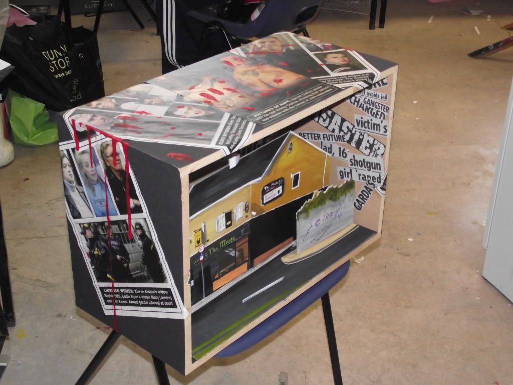
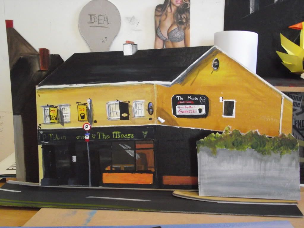
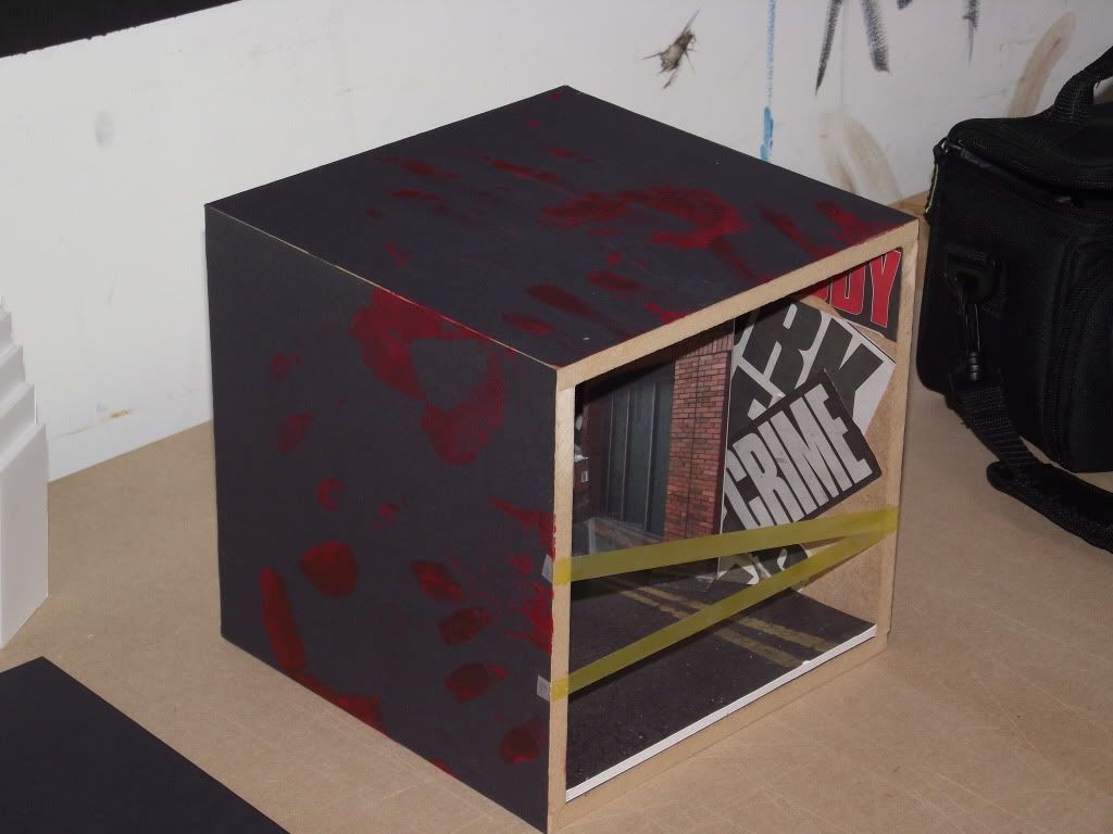
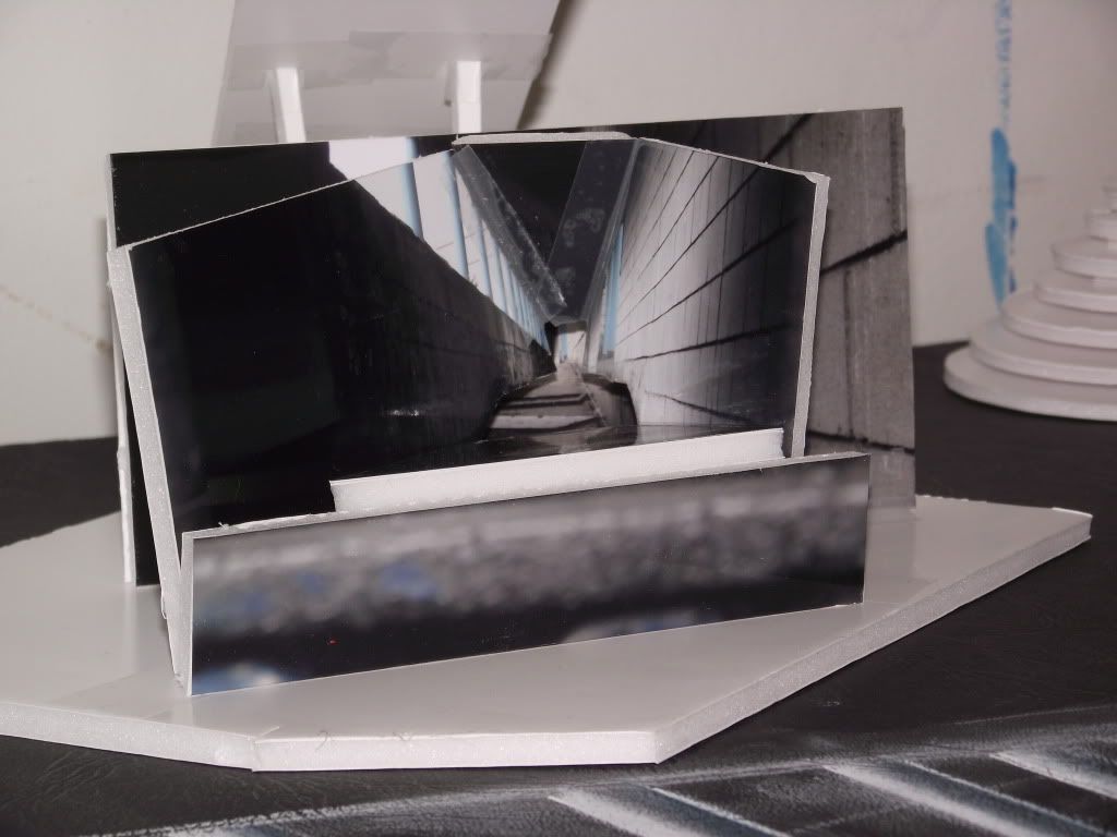
I have been neglective of my blog so far this semester but with the electives done and now in ranking it was definitly time i updated, i am not going to go into too much detail on the elective projects but i will post images of my work

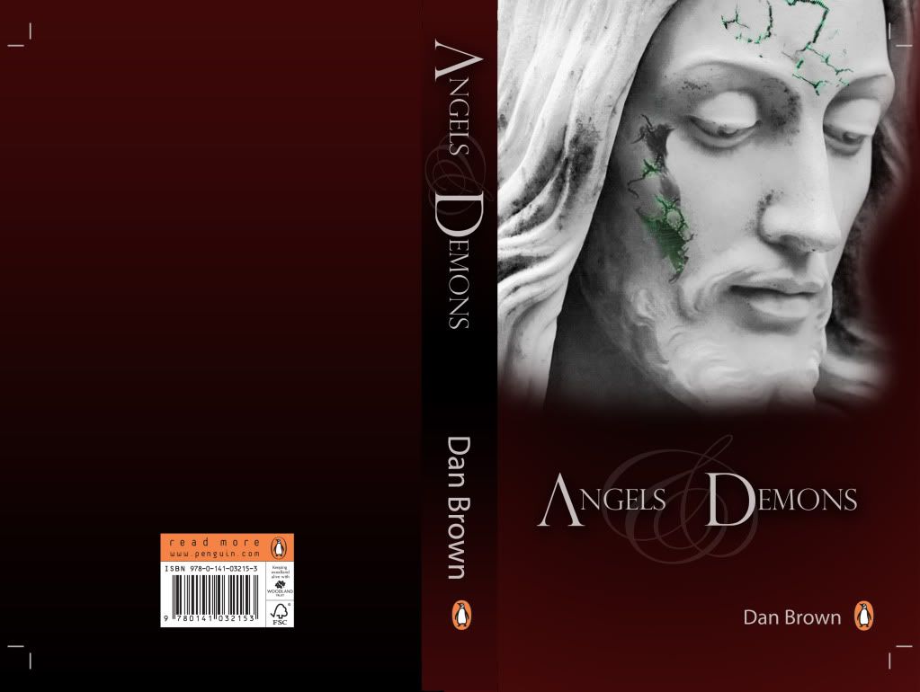
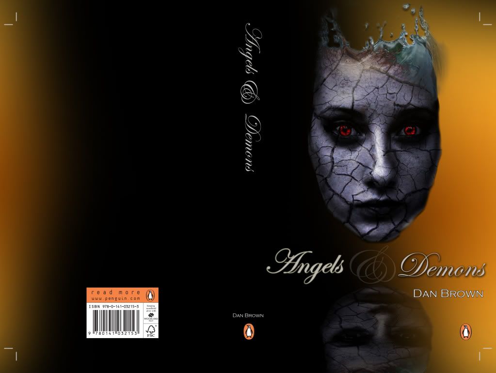
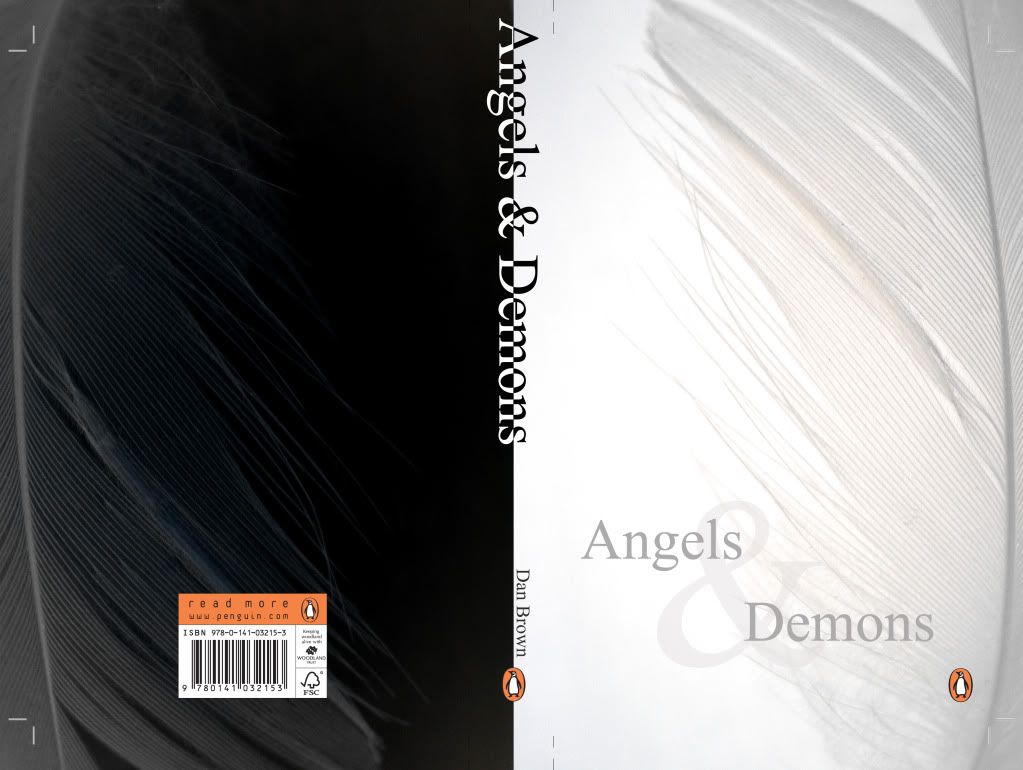
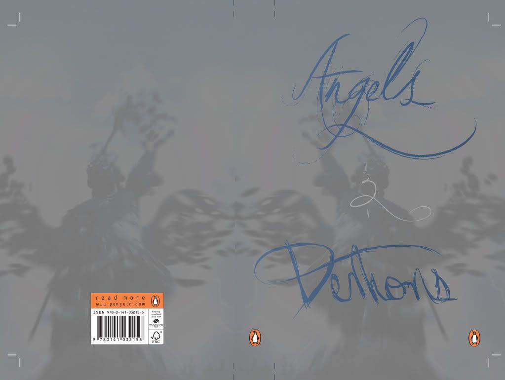
The First of my electives was Graphics and starting the year i was pretty adamant that i was going to be a painter but as faith would have it, i went and fell in love with design all over again. i think the atmosphere and the creative cogs getting a chance to run riot just sparked something in me that i was missing in the first semester. we were given a word and asked to approach the design of the word both typographically and illustrativly. Here are my resposnses to the brief.
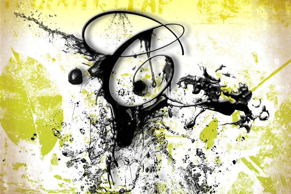
This was focusing around the idea of the death of the writter letter.


This image was an attempt to make the letter more modern and a little more appealing.


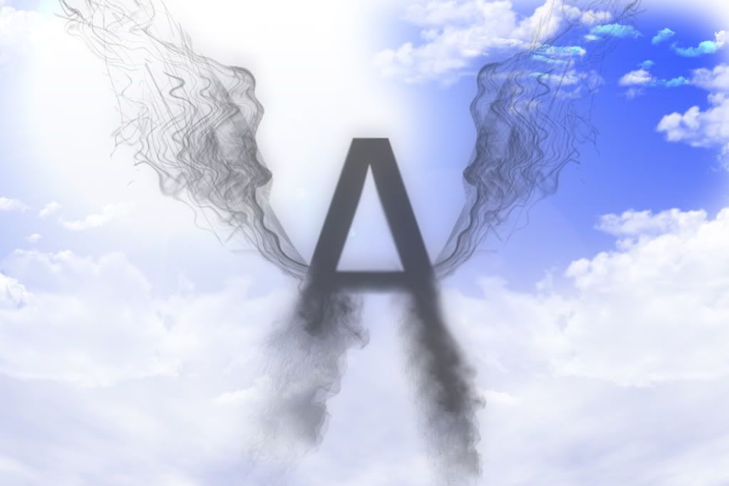
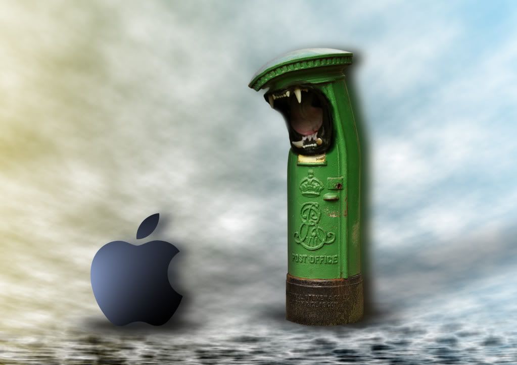
This is my illustration to show how technology has stamped out the written letter.


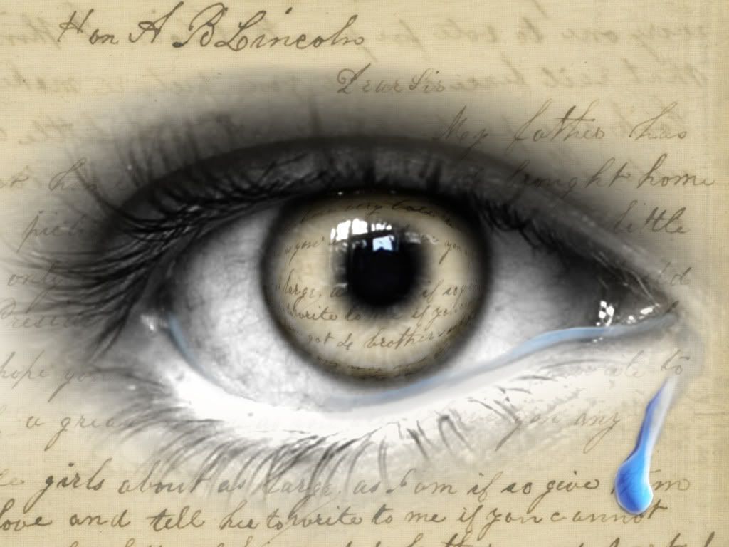
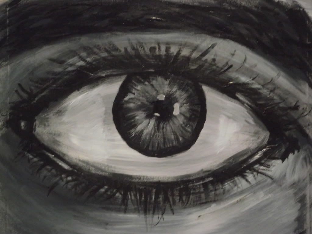
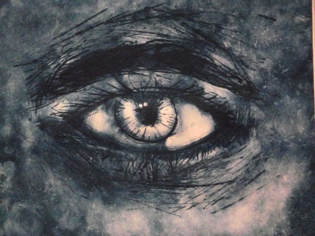
This was my favourite piece and probably the most effective, it's an eye with an origional letter from President Licoln to a mother whos son was killed in WWI, i added the tear to give the sense that the letter was crying ink as supposed to a tear, in hindsight a black tear would've worked better.


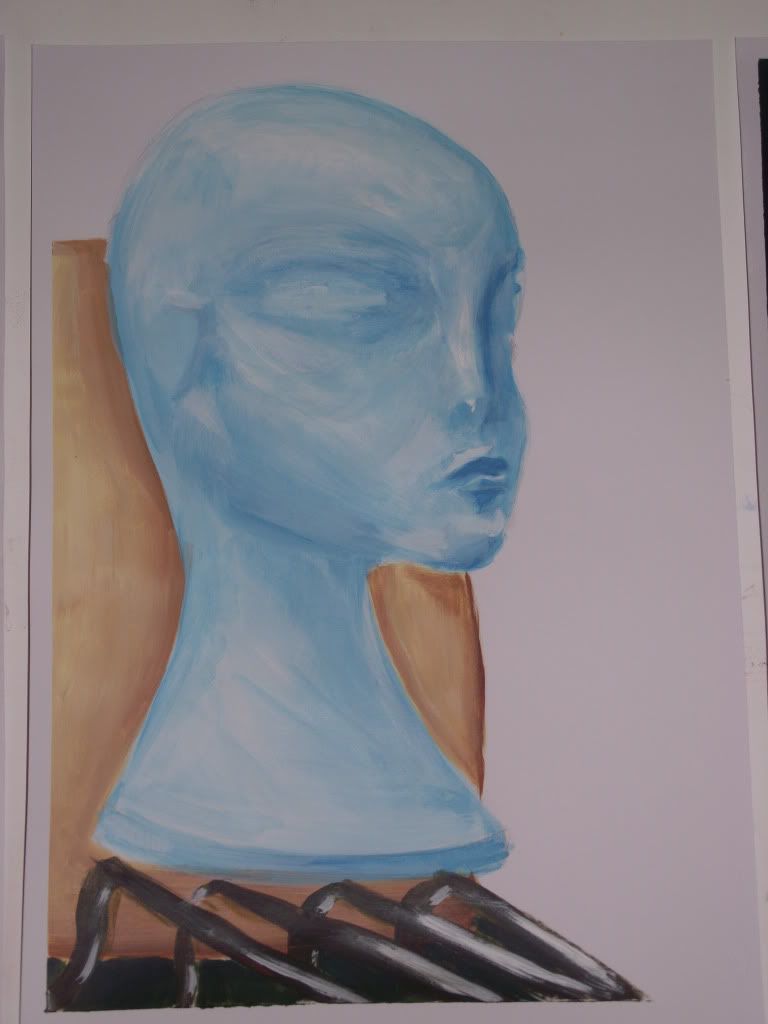
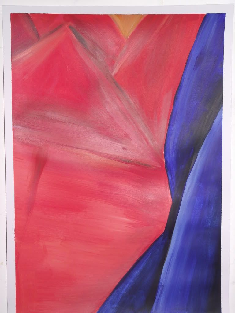
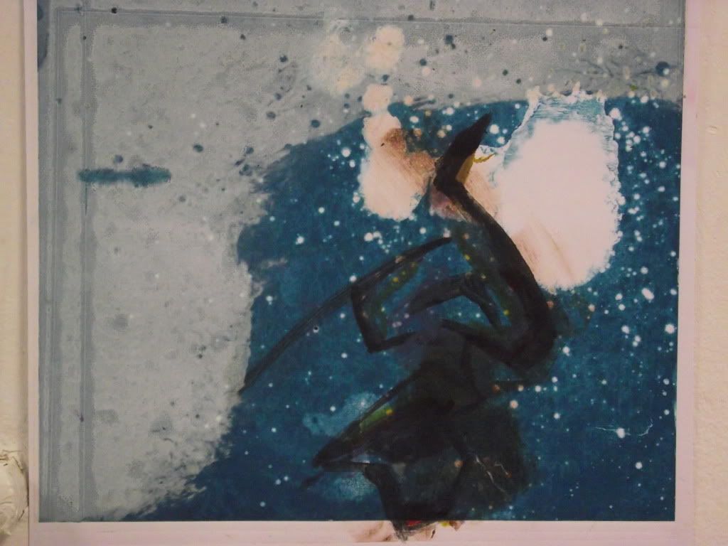
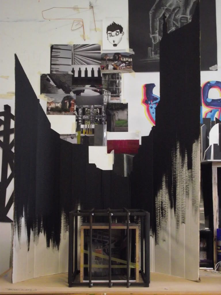
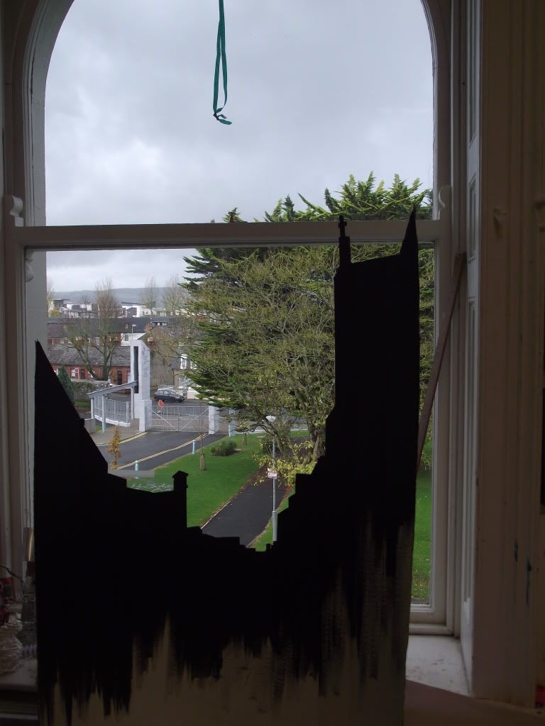
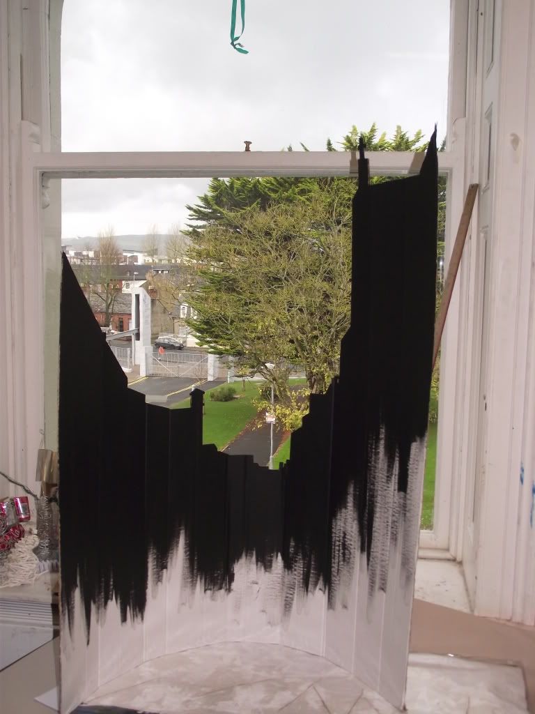
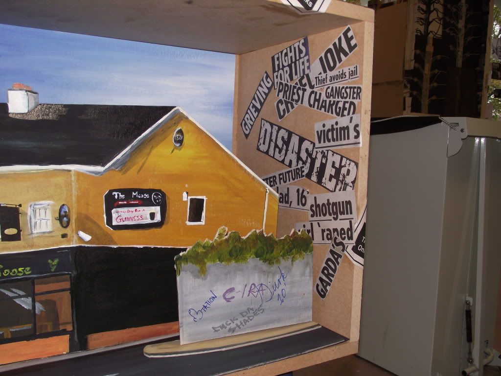
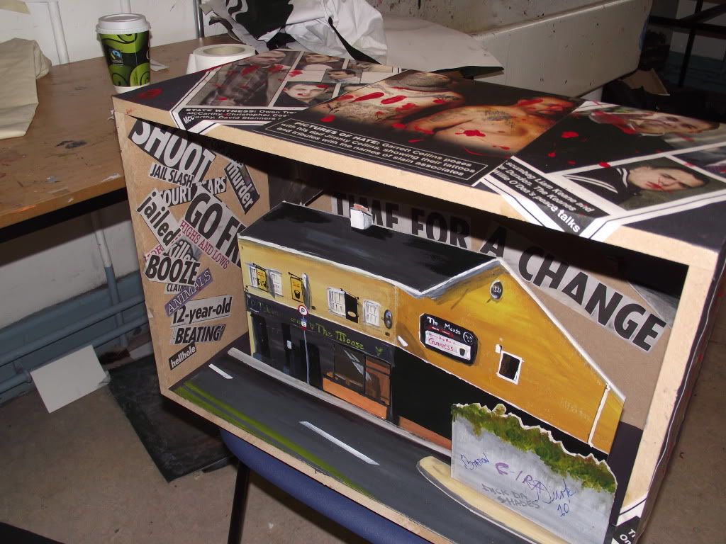
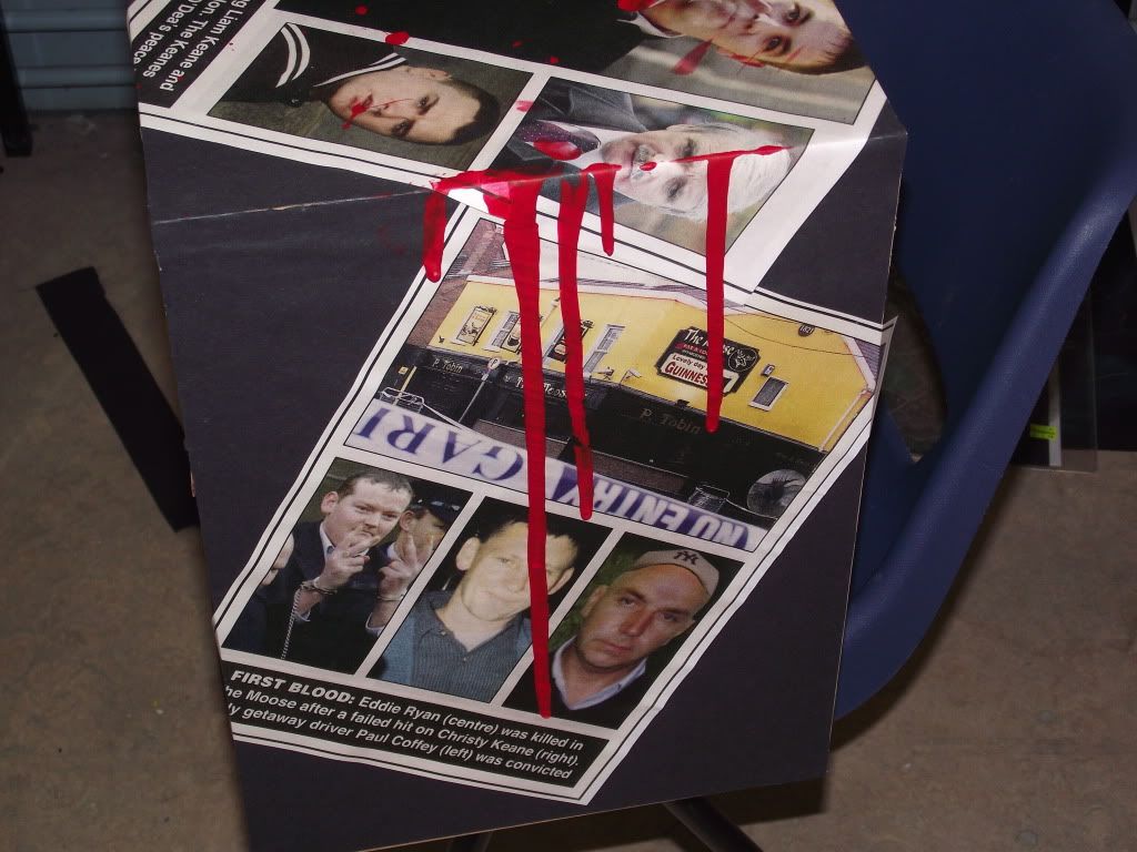
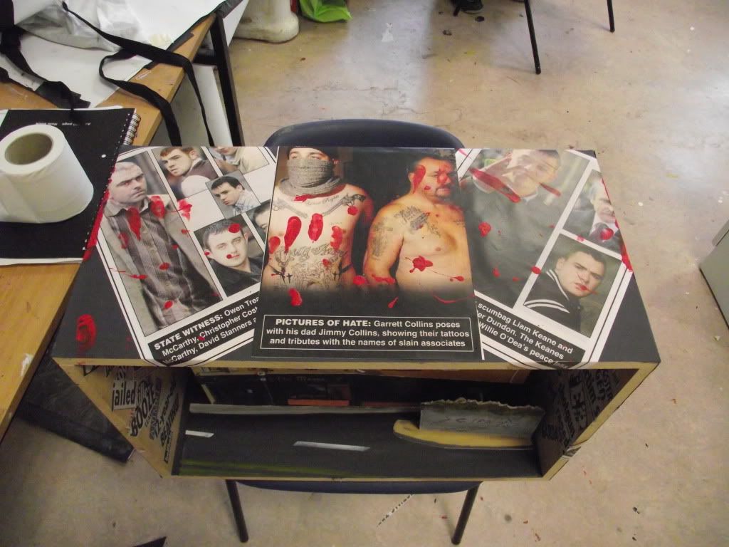
Painting was my next elective and if i'm being completely honest it was two weeks which i absolutely couldn't wait for, but once in the door i can't recall ten minutes of it that i actually enjoyed, i plugged away at it and didn't produce anything close to my best work but it's hard to get passionate about staring at an installation for two weeks.


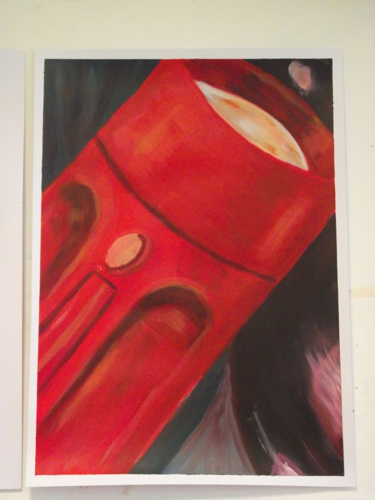
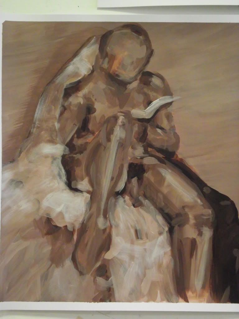
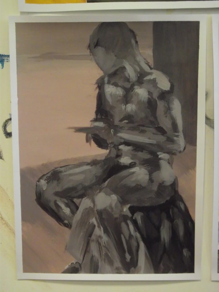
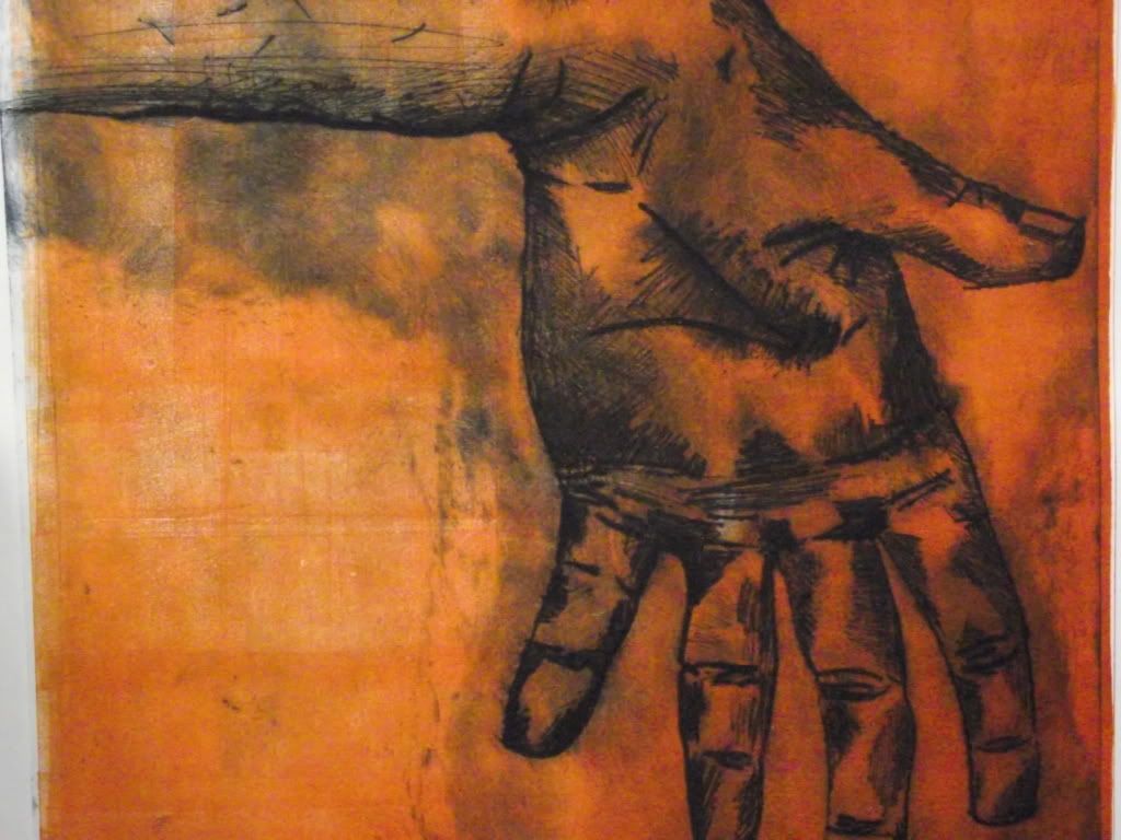
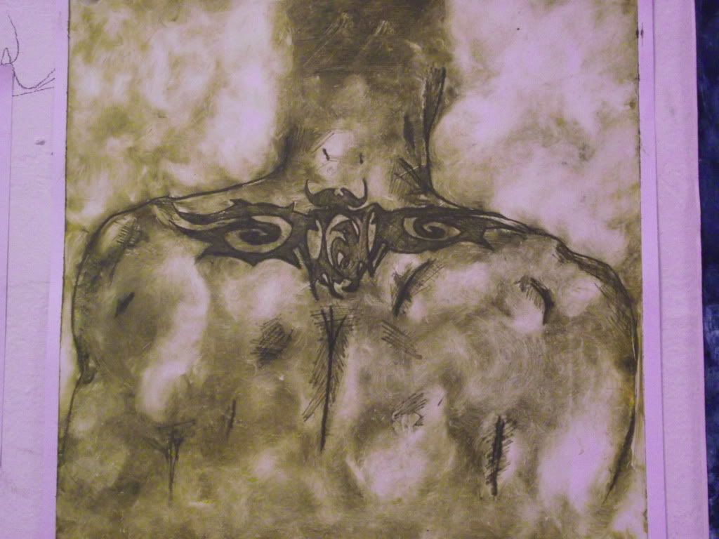
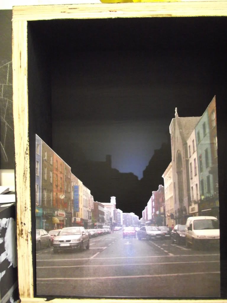
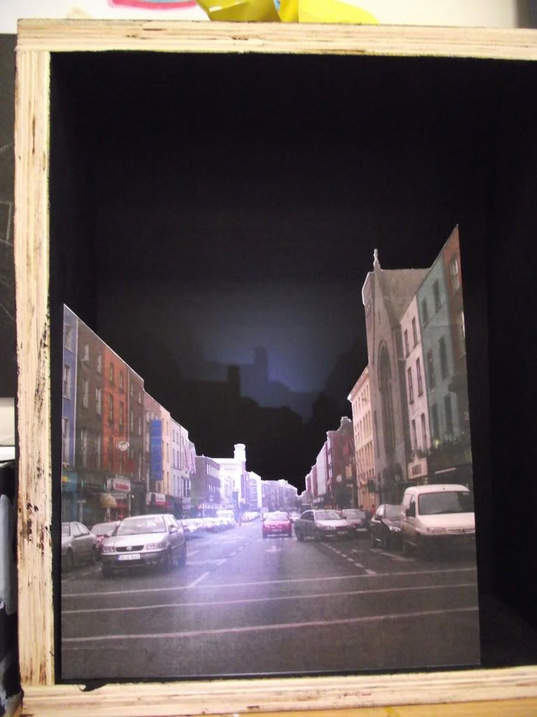
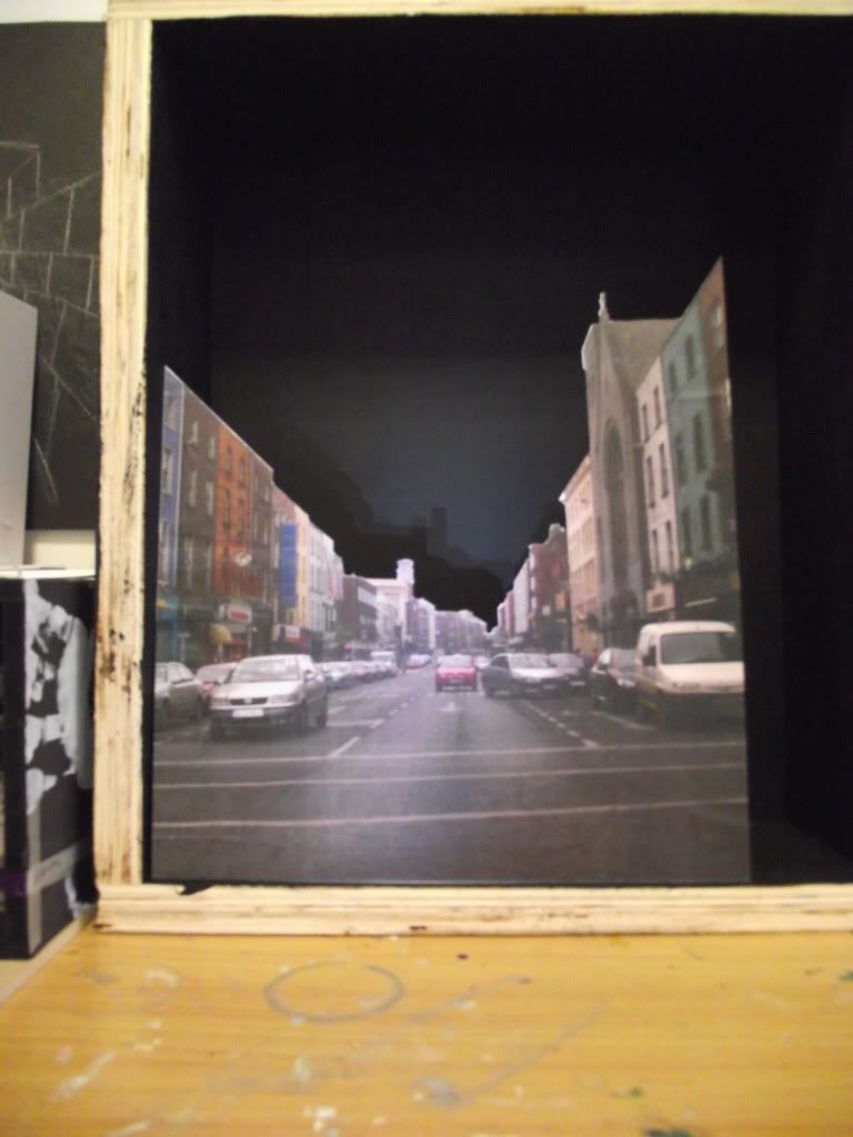
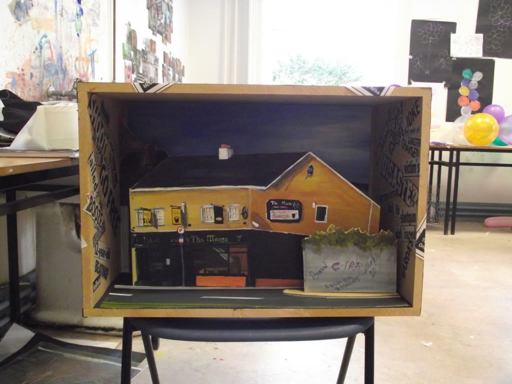
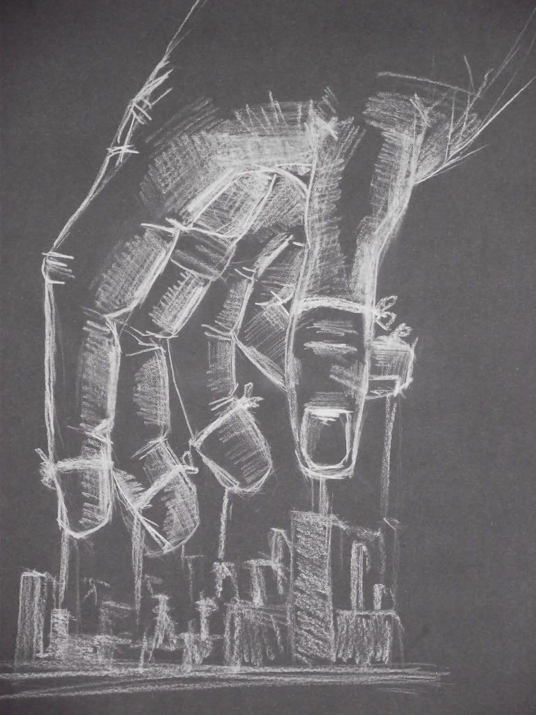
Print then was my final elective which i really enjoyed, and if i didn't love the graphics elective so much i would have had a hard choice to make, i studied past masters concept drawings of people and their study of the human figure, so with that in mind i decided i would do a study of different parts of my own body.

Monday, November 8, 2010

casting shadows

OK so this week we have feedback from our tutors and I'm expecting a serious boot up the arse and a bit of a bollocking but i wouldn't be the only one I'd say so non whinging and more work is the call of the day. I was messing around with a few more cutouts of limerick on card to keep producing more in the series of boxes (which I've been told to do a hundred times and i keep going off on tangents) and i just started playing around with throwing light on front of the image rather than from behind or within the box itself. What i found by doing that is a real depth and that spooky image of a shadow which always used give me a chill as a kid, like a mental picture of a forrest in a ghost story or something, and by casting two separate light sources in different directions and so forth instead of adding an extra dimension to the photo it added an extra dimension to the shadow itself which i thought was pretty cool and i think it is something that can only add more atmosphere to my project. So this week the plan is to mess around with lighting, coloured light and possibly sound to see if i can really emphasise the atmosphere and that uneasiness I'm trying to get across.

Monday, November 1, 2010

A change in direction...well slightly

Have you ever felt someones stare? Ever been somewhere so dark you could almost feel it? Ever catch yourself speeding up your walk through an unfamiliar place or locking your car doors as soon as you get in? I think everyone has at some stage, but is it because you feel unsafe or is it the mood of where you are that you just don't understand why this uneasyness comes over you? I think the darkness is associated with eery feelings but i think light can also provide mood so that is what i want to explore with my models. Along with the models that pose a question to the viewer i also want to try and create an atmosphere with them so that it does pose that question inside of feeling the unknown!!

Tuesday, October 19, 2010

A hard week

Well last week my project hit a speed bump in the form of the tutors and my pride......still following what i'm doing with the 3D little scenes from limerick i decided i'd paint the image instead of just manipulating the photos, not the best idea i've ever had but i didn't want to be accused of not trying other media and different ways of representing the scenes i was making other than just photographs. I personally didn't think it was that bad to be honest but i did invite a bit of an onslaught of criticism from the tutors because painting wouldn't be my strongest area. In other words.......they thought it was shit.


Now, i could see where the tutors were coming from so i'm not gonna say they were wrong, but at the same time i did want to finish it and have it there so they could see at least what i was trying to represent. So i did, and as much as i tried to stick up for it and try and convince myself that it wasn't that bad.......a small bit of pride swallowing took place and i have to really agree that it just plain and simply doesn't work. I still wouldn't consider it a waste of a week because there were parts that i can take and use them in the following pieces so all is not lost but here are a few pictures of the finished pieces anyway and i'll hopefully have something a little better and more positive on my next post.

Wednesday, October 6, 2010

Concept ideas

Here i just have some images of the models i made and some idea's that ran through my head. I am not going to reveal the context of the models and their significance because i want the viewer to make their own connections and conclusions of what the finished project is about.